
To Top
E3: Greenscreen Exercise (15/10/2020)
Exercise 1: HUD Analysis (25/02/2022)
What makes Dead Space's HUD incredibly unique is that in reality, it's not a "heads up display" at all.


Anything and everything that informs the player about their in-game status is implemented in the main character's armor.
Dead Space is set far in the future, where humanity has expanded to planets and space stations far from Earth and the currently observable universe.
Most people living in these planets and stations, mainly adults, are given a RIG, or Resource Integration Gear, which helps with everyday tasks and more advanced tasks as well, from mining, construction, engineering and assisting soldiers in the military.

The suit shows the character's general state of health at all times, along with other meters and more traditional displays:
-
Health is represented by the spine mounted display going down the player's back. When depleted, in the game context, it means the player has died and the suit emits a loud, flat line beep, which in the game world context, is meant to warn others about a person's critical health state;
-
STASIS energy available, the power source of experimental technology which let's the player temporarily slow down quickly approaching enemies. This was a tool made to prevent accident in mines and to facilitate other miscellaneous tasks;
-
Inventory and other Menus are projected from the suit, for the protagonist to see. These are presented in a way that anyone in the game world could really use them, the player character even reacts to the menus, following the reticle in inventories and thinking in the mission objectives tab;
-
Ammo is presented separately from the suit, but is still well integrated in the world, being shown instead by holographic projections coming from each gun;
-
Even the Aiming Reticle is part of the world, being projected from the end of each gun and reacting to the world like a real laser pointer.
I point out the in-universe uses for some of these to highlight how everything is part of the world, none of these are just "something" that the player has access to.

Being a horror game, the goal of the developer is to immerse the player as much as possible, and I feel like this is, to this day, the most immersive display in a third-person shooter, horror or not.
This let's the player focus entirely on the world, as the game doesn't ever break this immersion to show information in a traditional way. In fact, the "HUD" that's shown is physically a part of the game world, seeing as the environments react to the light produced by the menus and the suit itself, so much so that it is it's own mechanic, since in dark areas, apart from the flashlight given, the suit's lights illuminate the darkness.
It's functional, visually appealing and fitting for the game's world and setting. It's a perfect HUD.
E2: Group Project Proposal (07/03/2022)
For Designing for Interaction, me and a group of fellow students had to band together and create a short game.
The aim of our project was to make a simple game that exemplified the core aspects of good User Interface (UI) design and generally good User Experience (UX) design, these core aspects being: informing the user of their objectives, capabilities, opportunities and limitations within our game, all as quickly and concisely as possible, preferably with as few words as possible.
Our game would be called Bounding Steps, and the details for this project can be read in our initial formal proposal.

Group Members


Gonçalo Miranda
Group Leader, in charge of Planning and Coding
Group Game Builder, in charge of Level Creation and Organization
Group Artist, in charge of Concept Art, Asset Creation and SFX
E3: Adobe XD (09/03/2022)
Adobe XD is a software made especially fort he creation of user interface designs and prototypes.
We had a quick run through of it's features and one of our team members, Lorena, made our first ever concept art for the game's menu.
As it required to be drawn, it ended up being more work than we thought was worth, so it was crapped and replaced with a much simpler and traditional menu design.
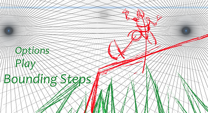
The original idea was to show the world the player would inhabit and it's dangers.
A dynamic angle would grab the players attention and the game character would almost lead the player's eyes onto the options in the menu, so overall I think it's a solid concept.
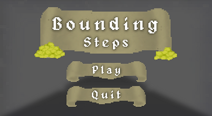
Due to time constraints, changes of plans and focus being split between different projects, the menu was turned into something much more traditional and easy to grasp.
This is our current concept for the game's menu.
With the changes of plans that occurred throughout the game's development, the setting and ambience of the game changed, thought this will be explained in future sections of this page.
The background featured here is merely a placeholder, the game itself would be the background of the menu.
E4: User Persona (10/03/2022)
A user persona is described as follows:
"User personas are archetypical users whose goals and characteristics represent the needs of a larger group of users. Usually, a persona is presented in a one or two-page document. [...] Designers usually create user persona template templates, which include a few fictional personal details to make the persona a realistic character [...]."

Understanding our Audience
Lewis Jones is looking for fun, casual retro games to entertain him in his free time and also possibly stream on platforms like Twitch or YouTube. Due to his full-time job as a barista and wanting to spend time with his fiancé, he prefers short, but action-packed games.
His main criteria when looking for perfect games for himself are: retro, pop culture-inspired and of a short duration to fit into his tight schedule. We made Bounding Steps for gamers like him, giving them a short, fun platformer, reminiscent of retro games and pop culture influences like the original Tomb Raider games, Sly Cooper, Sonic the Hedgehog, etc.
Lewis would find our game a great match for him and his gaming needs as the game is easy to play and master, with basic platformer controls like Spacebar to Jump and WASD to Move, and a simple UI that offers players all information they need to enjoy the game. He’d play Bounding Steps because it would remind him of iconic retro games titles, while also bringing new ideas and concepts to the table.
As explained by Lorena.
Assessment 1: Bounding Steps Game Project
To start off the project, our group needed to decide what our game would be.
From the very start, a platformer was in consideration, and after going through other ideas, we settled on creating a simple, obstacle based, 3D, first-person platformer, visually inspired by classic dungeon crawling games and Indiana Jones and mechanically inspired by Minecraft. The idea was simple and achievable, so it was ideal to create an actual game while being able to show off functioning UI and HUD elements, which was the main objective.
Multiple Level Concept
Originally, our game would have 4 levels: a Tutorial, with a water theme, a Main Hub, with a grassy valley theme and a Dungeon and Fire levels with the objective of obtaining keys to open the path to the End of the game.
The tutorial level was briefly worked on to try and visualize certain aspects of the game before full on development started, but we ended up scrapping the idea.
.jpeg)


Initially, the art style for this first concept would be based of of Minecraft's cubic and modern retro look, though only a single asset was made, to test out how the modelling and texturing would work.

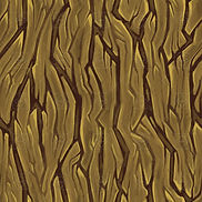

Modelling was predictably simple, though getting edges perfectly straight and even was sometimes challenging due to software issues.
This was more so a way to test out texturing. A pixelated look was the objective from the start, so Gonçalo ended up testing a method which involved just taking a picture from the internet and lowering its quality. This worked a couple of times, but was very unreliable and inconsistent, so it was not used moving forward.
Single Level Concept

We realized that making 4 separate levels would be too much to pull off with the kind of game we were making, so we cut it down to just one: the Dungeon. The objective is to, as you explore the dungeon, collect coins and grab the key to unlock the treasure at the end of the level.
It's a simple level concept that's very achievable, and it enabled the creation of fun assets and textures.
But before that, we visualized how the level would look and move.
These are very basic greybox visualizations made in Maya. We wanted to use multiple types of obstacles to add variety to the level, mostly for the sake of it, as it wasn't critically important.
Normal Platform - A simple, unmoving, floating platform;
Moving Platform - As it moves, the player needs to move with it to not slip off;
Sliding Platform - It comes out of the walls and the player needs to traverse it at the right moment;
Bouncing Platform - A platform with a magic crystal to make you jump higher.
Due to the Bouncing Platforms, the level had to incorporate elevation is some way, so throughout the level, the player will go up and down the dungeon floors.

As this was the more developed and liked concept among the group, this is what we ended up going for.
Full On Development
Asset Creation was the first element of the game's development that reached completion, as it was relatively simple. bellow will be some screenshots of just a few of the assets, mainly the most visually diverse and telling of the game's art style.


And as you can see, the assets were textured in a retro pixelated style. These textures were all created from scratch in Photoshop by Gonçalo, instead of relying on previously existing images. The way this was achieved was by simply drawing in a 40x40 pixel canvas, then scaling the entire image to 1000x1000 with a specific setting.
This took a bit of practice, as seen with the old Chest texture. Thanks to this chest, early on, we realized textures needed to be more bold, with defined edges and differentiable colours, to help the model look less flat and uninteresting.

But as there are many textures to show, all of them will be neatly compiled bellow.

Geometry & Platforms
Door, Chest, Spikes & Items


Decorations
MENUS & UI Design
Since we're creating a game, creating menus was a critical step of the user experience. To keep the visuals consistent, Gonçalo used the same techniques explained previously to create retro looking Titles, buttons and sprites to decorate all of the menus and the players Heads Up Display, or HUD.

The Main Menu, fittingly, was the first menu to be created.
Scrolls were used as the background of text, to go with the 8bit/retro medieval look of the entire game.
The font that was used, Alagard, also fits with this aesthetic.
While creating the Death/Game Over screen, we decided that adding a bit of humour would help with the game's over all experience, since if the player dies, having it be taken seriously is not as fun.


This was the final concept for the HUD the player would see once they're in the game.
Although initially the level's objective would pop up to inform the player, we felt implementing objectives and tips into the level itself as wooden signs would be more interesting.
Once the player reaches the end of the level and claim it's treasure, they're presented with the You're Rich! screen, serving as the game's final menu.
Don't spend it all in one place!

Game Building & Coding
After the assets and textures were made, the game itself needed to be made. Scott was in charge of putting everything together. At this point, our group was still a bit unfamiliar with Unity, so other than the expected learning period, this part of the process was relatively simple as well.
There was, however, one hiccup during this stage of the game's creation. Due to a problem with Unity, the size of textures on the game's general geometry (floors and walls) was unable to be changed. In this case, the result is as seen bellow:
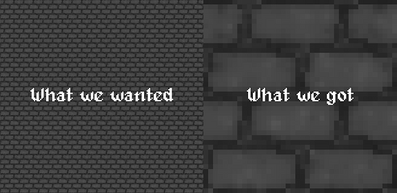
Other than the level's geometry, all other assets worked as intended.


When it comes to coding, the process was relatively simple as well, although, since this was Lorena's first time coding a proper game level in Unity using C#, and not C++, which she has a background in.
Through both lessons and online tutorials, various mechanics and aspects of the game were coded, some of which will be shown bellow.

This is the code used to program one of the buttons on the game's main menu, specifically, the Play button.

Artstyle
We're happy that fellow students enjoyed the look of the game, as it was a major aspect of the development process.